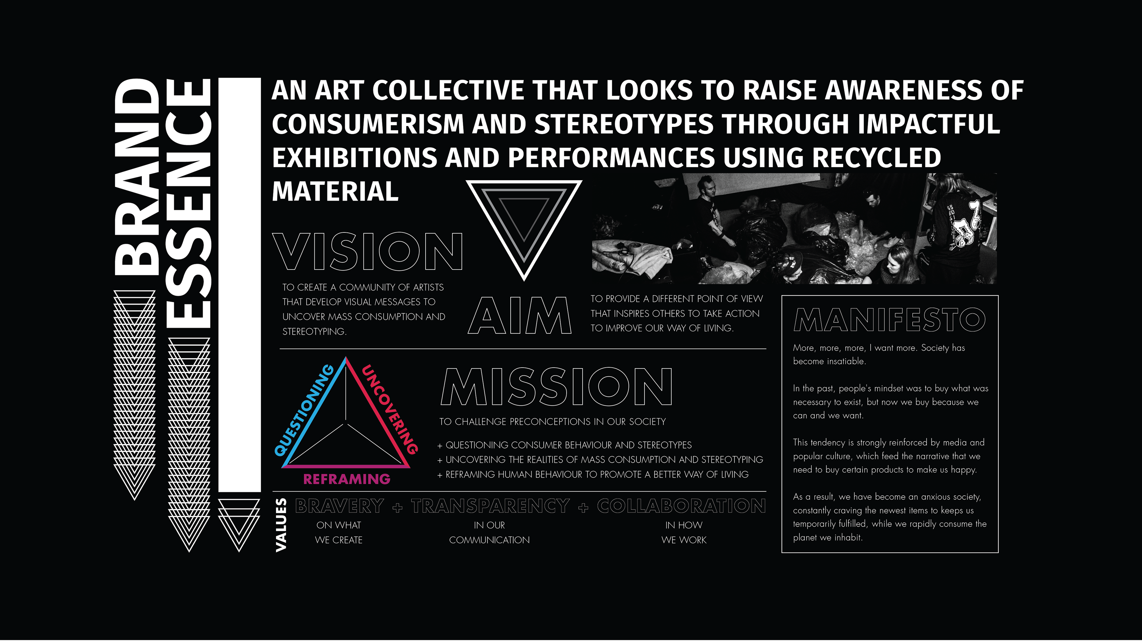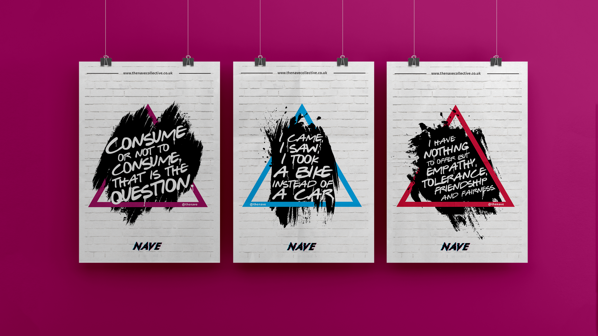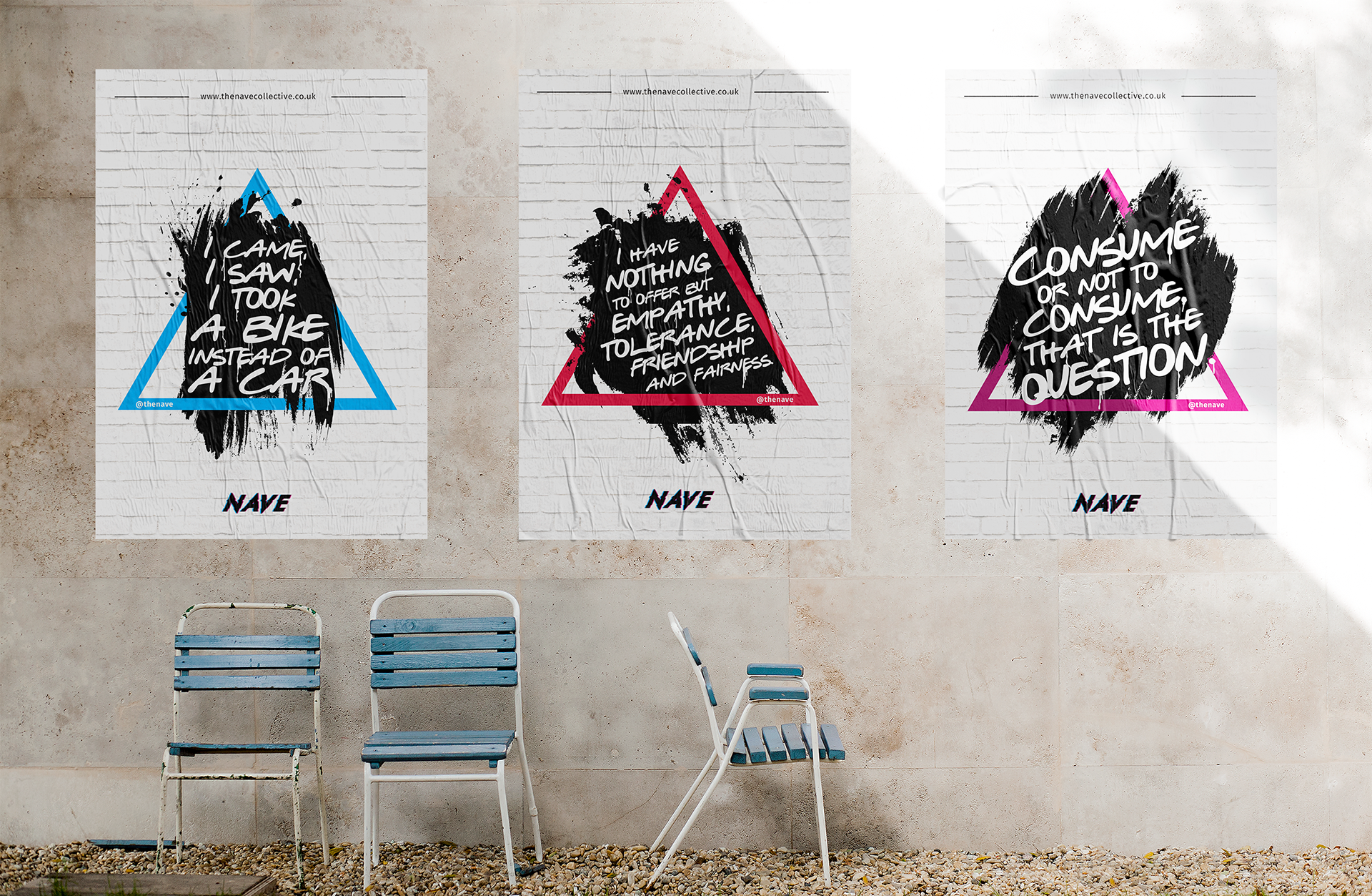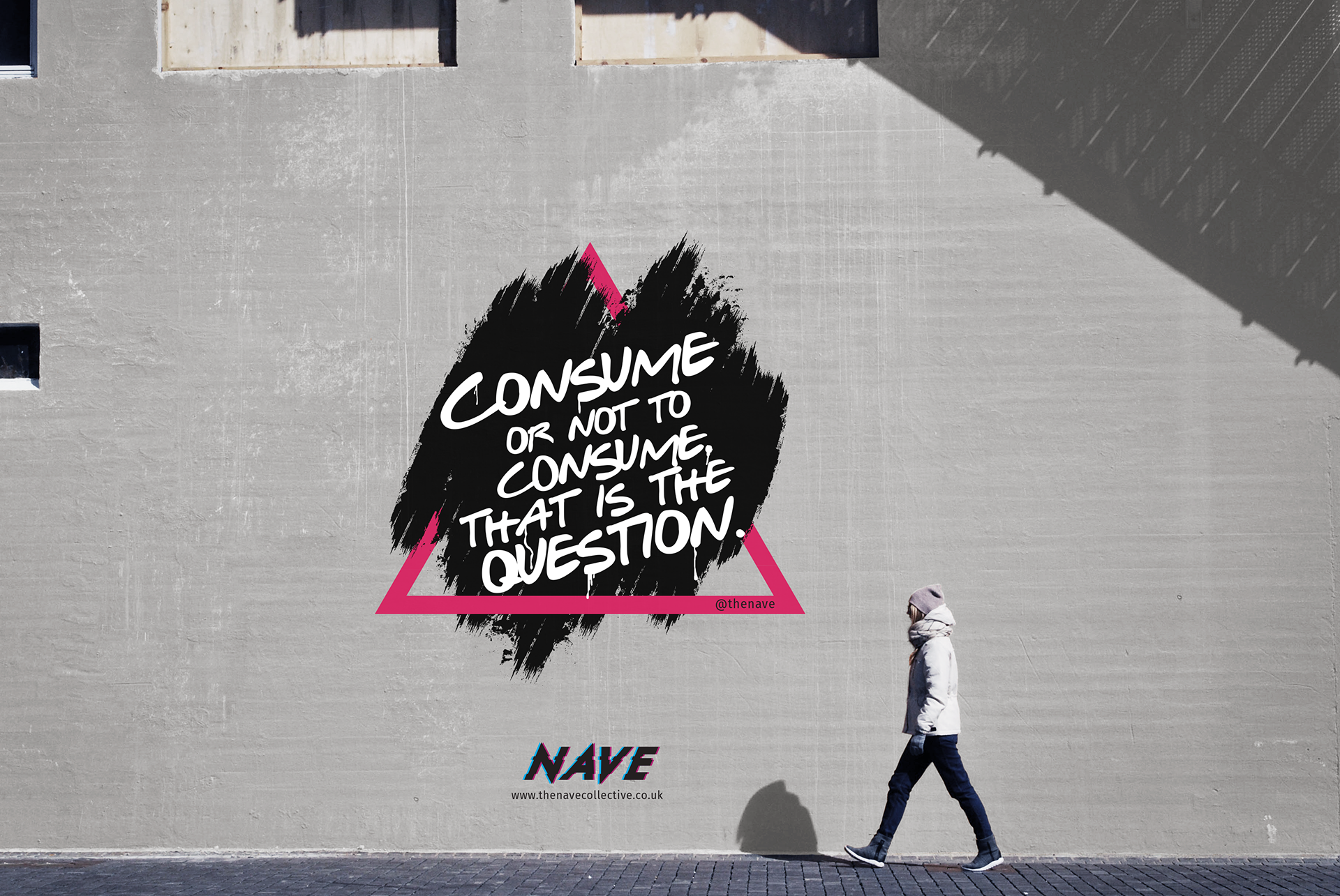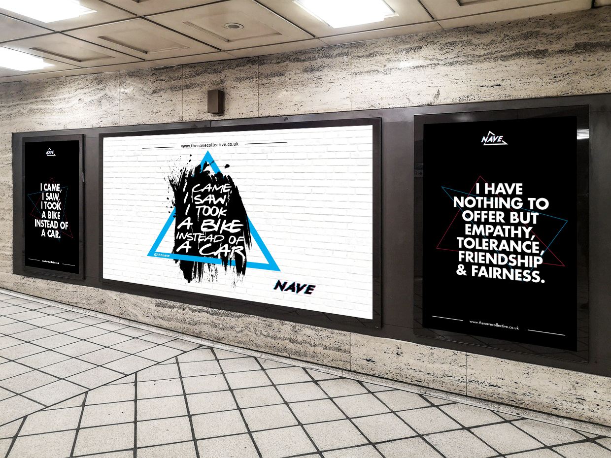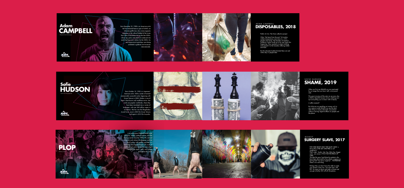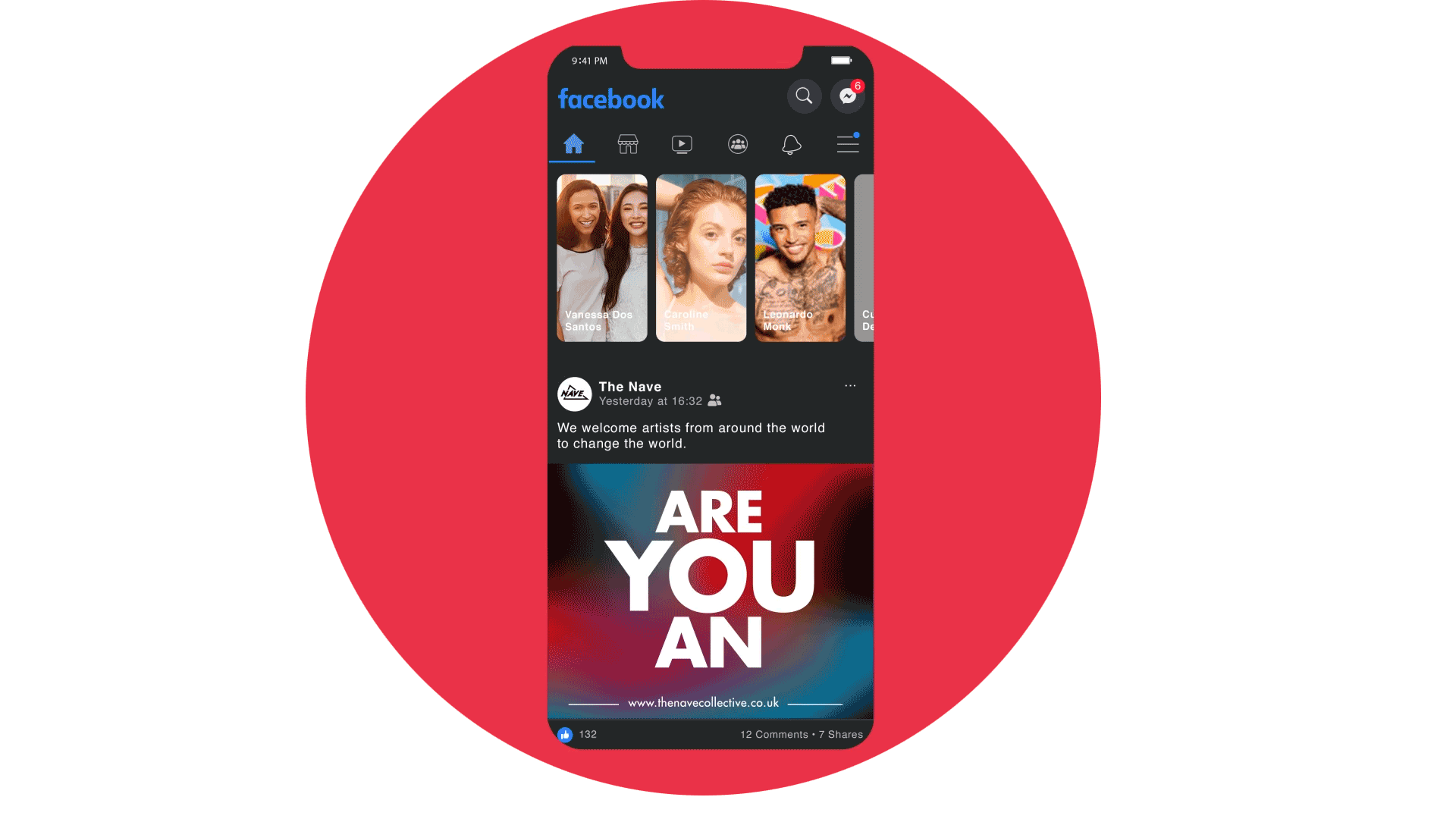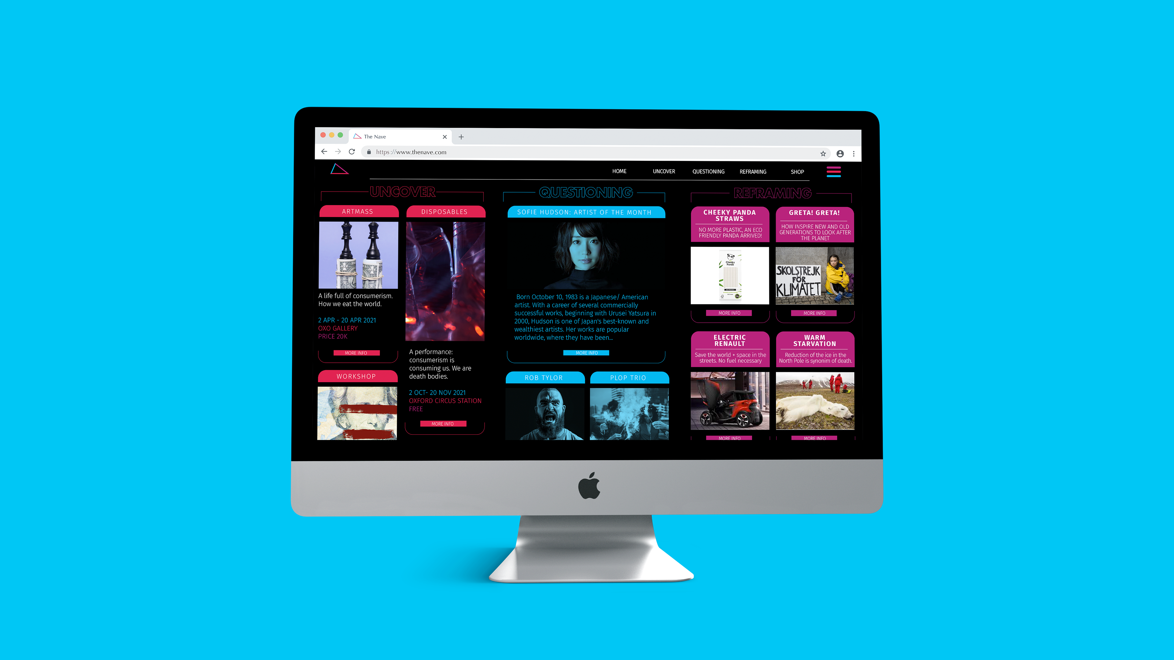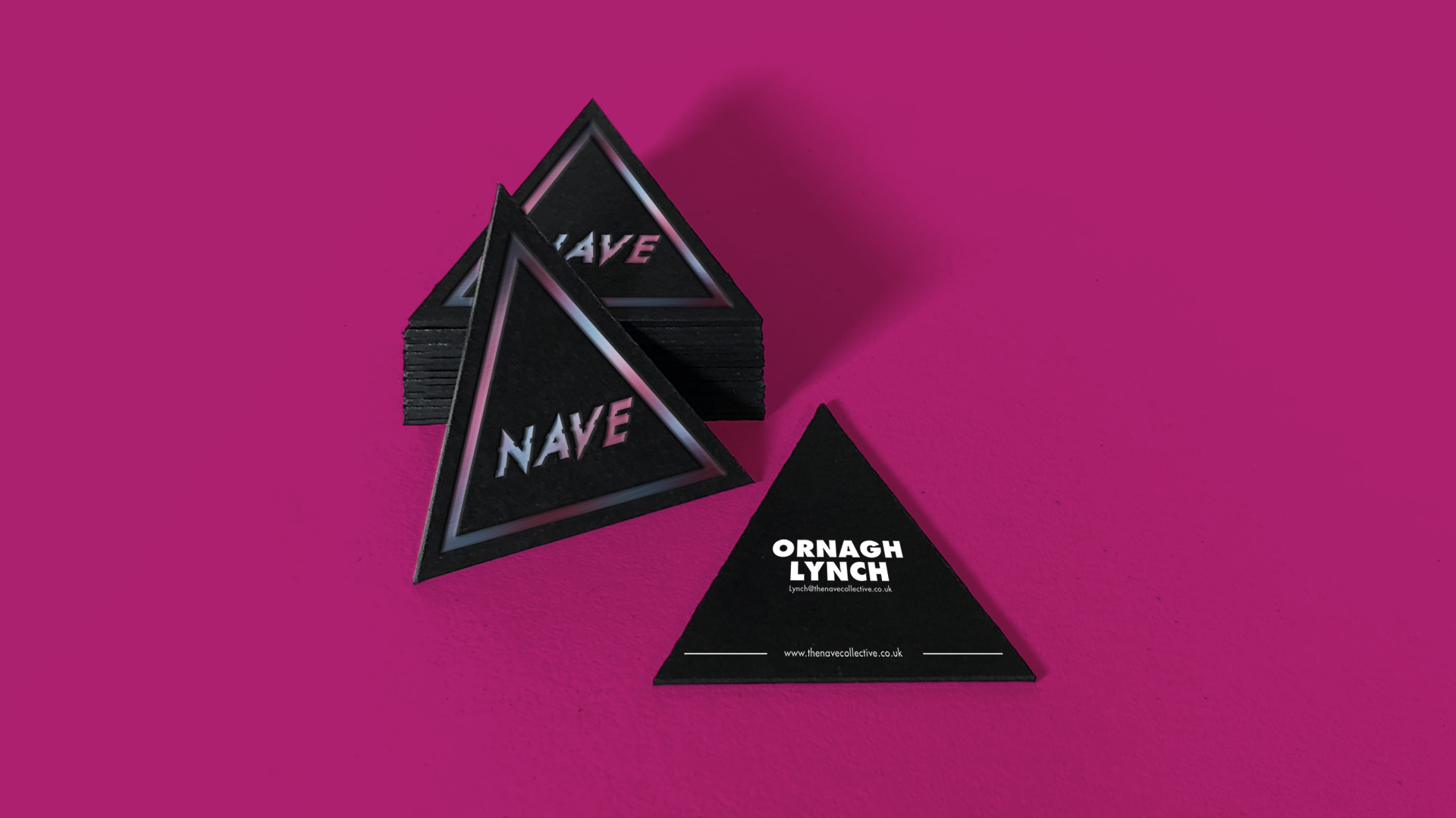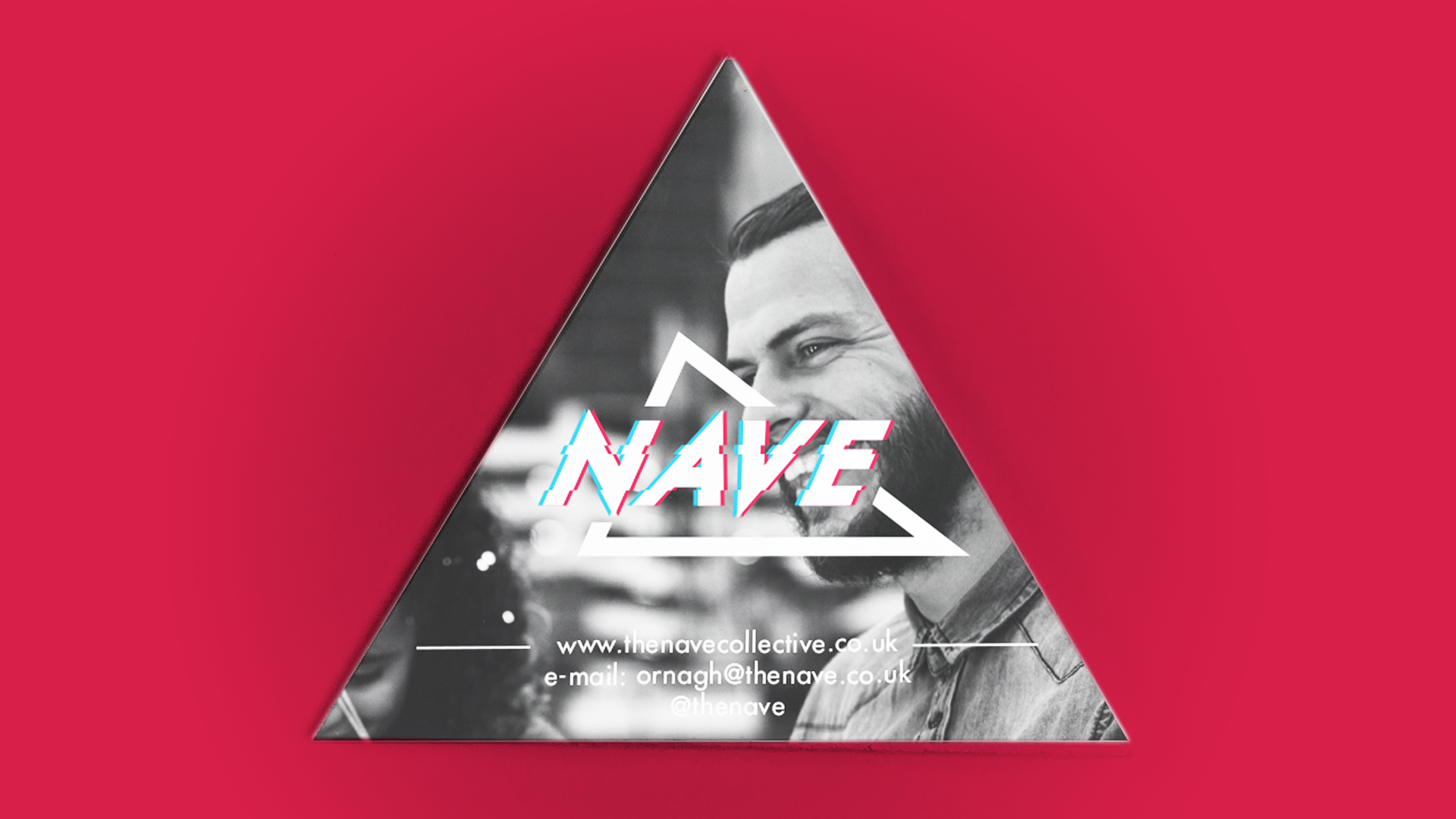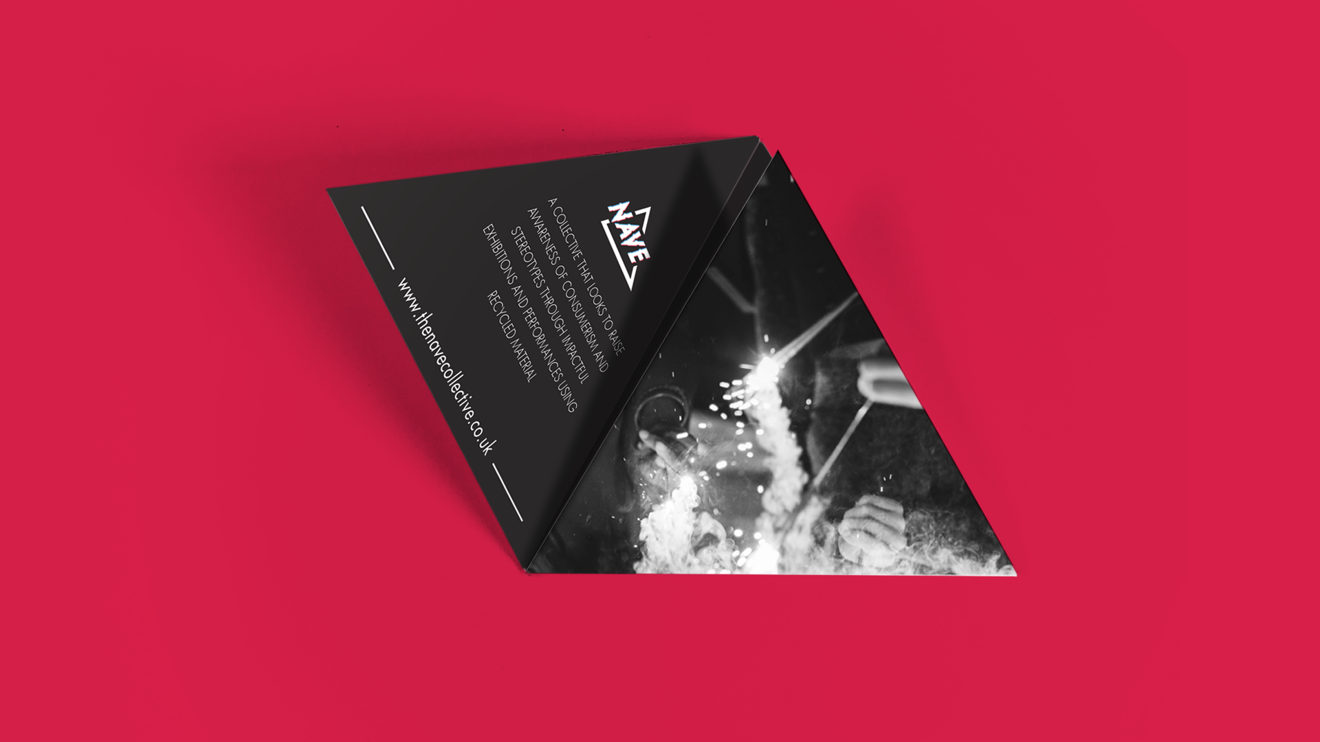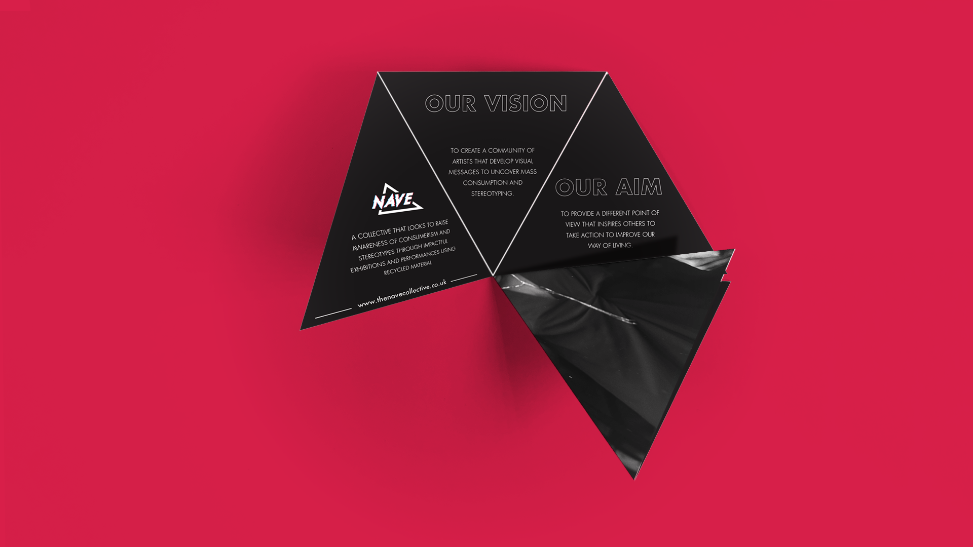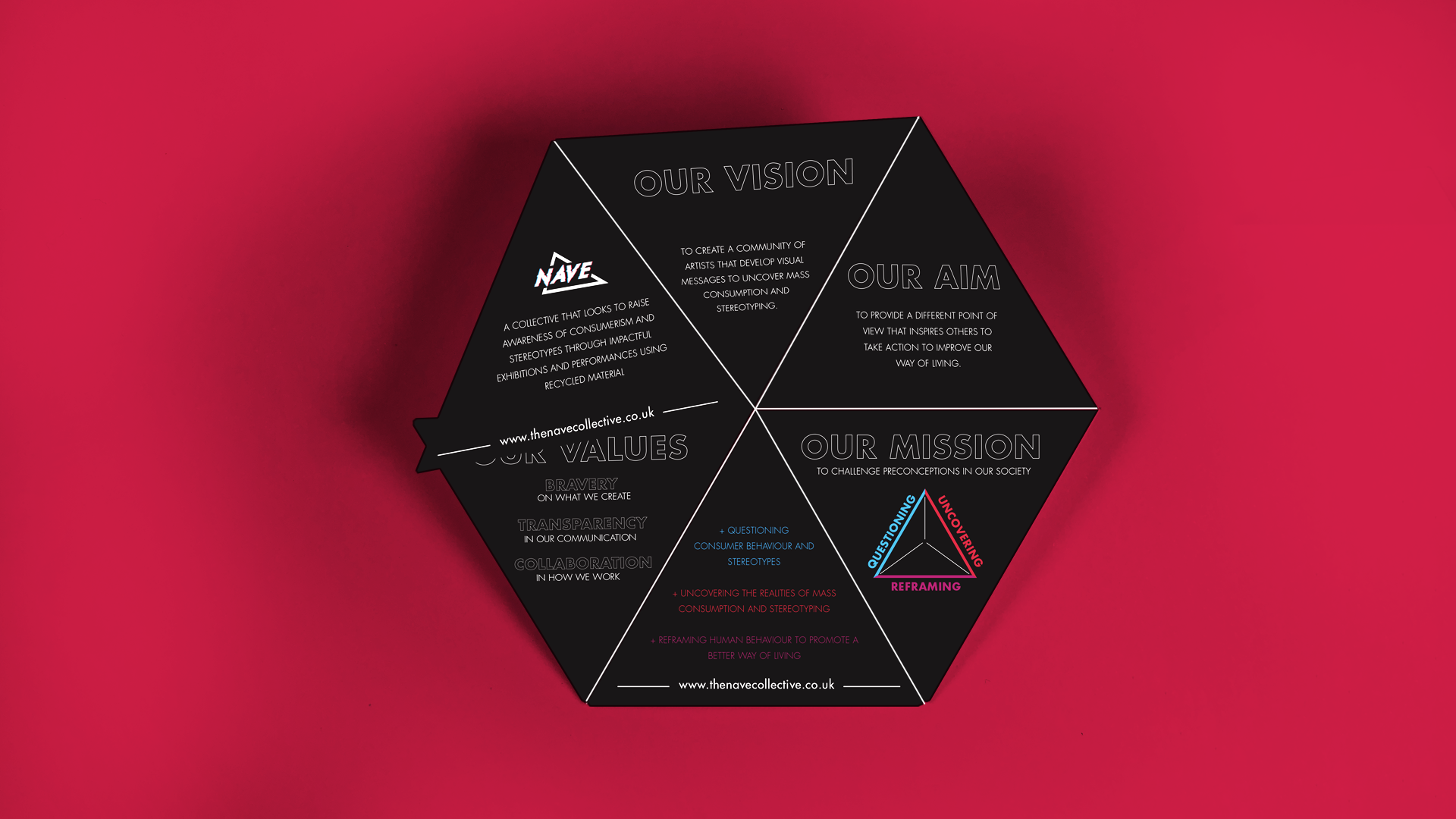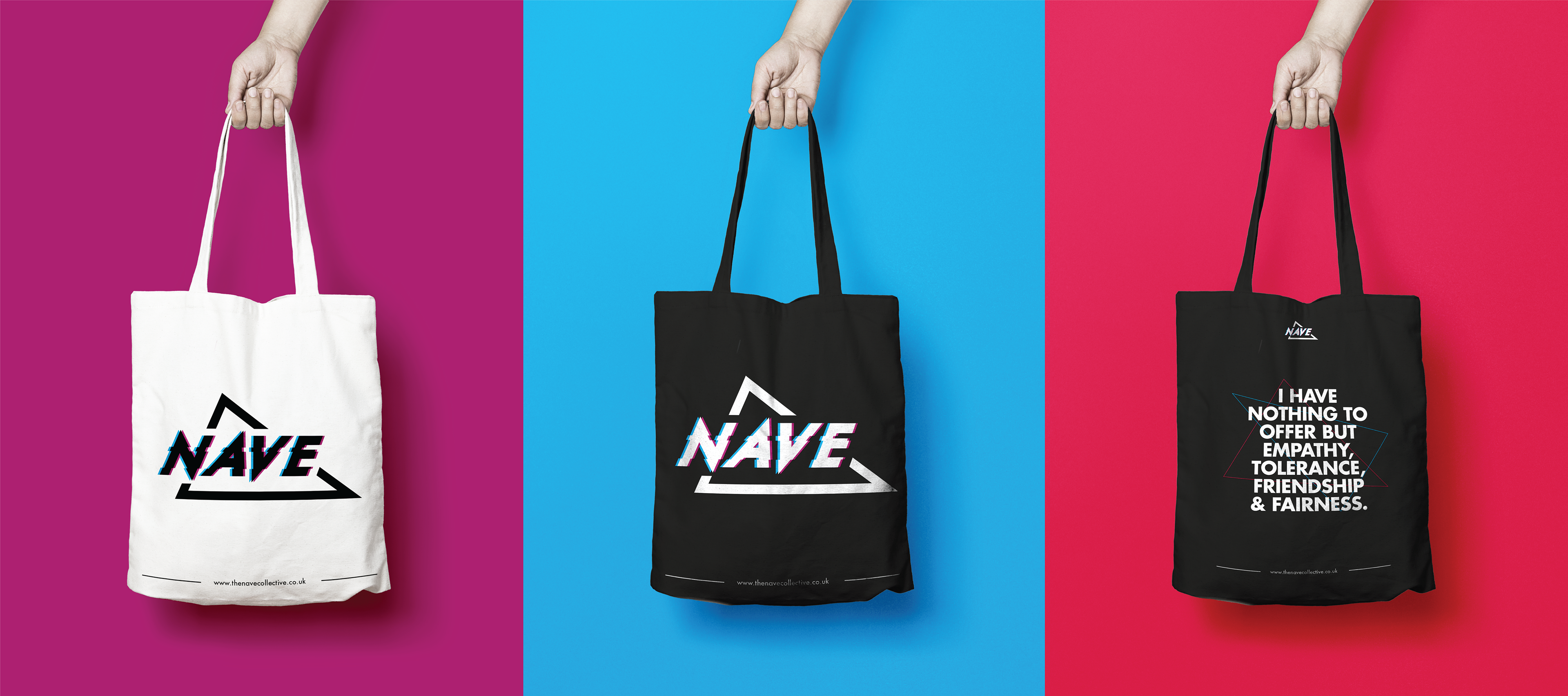
The Nave is a collective of South London based artists, looking to create awareness about mass consumption through performances and exhibitions.
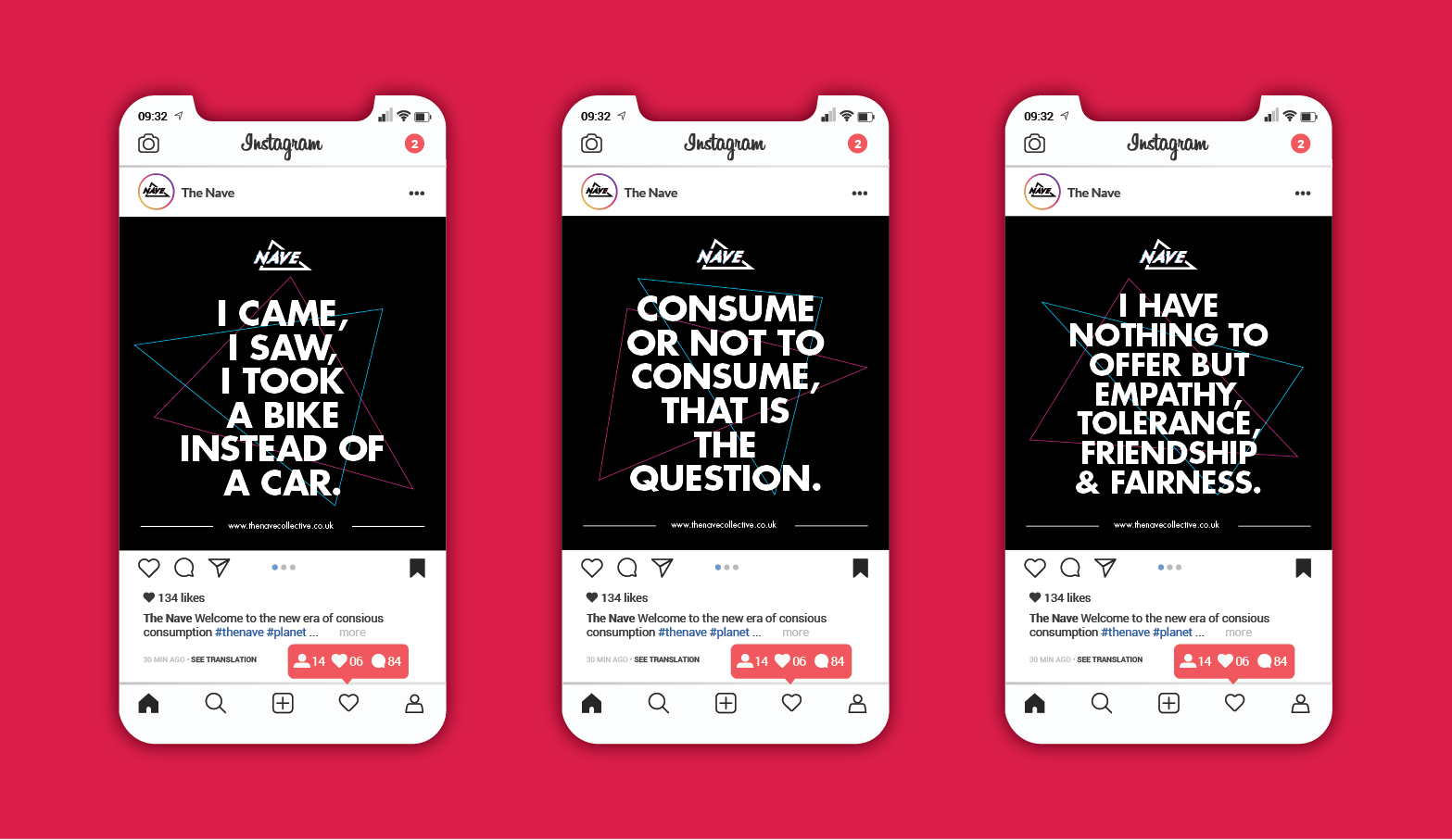
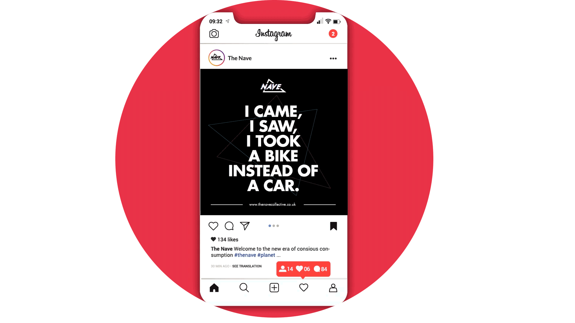
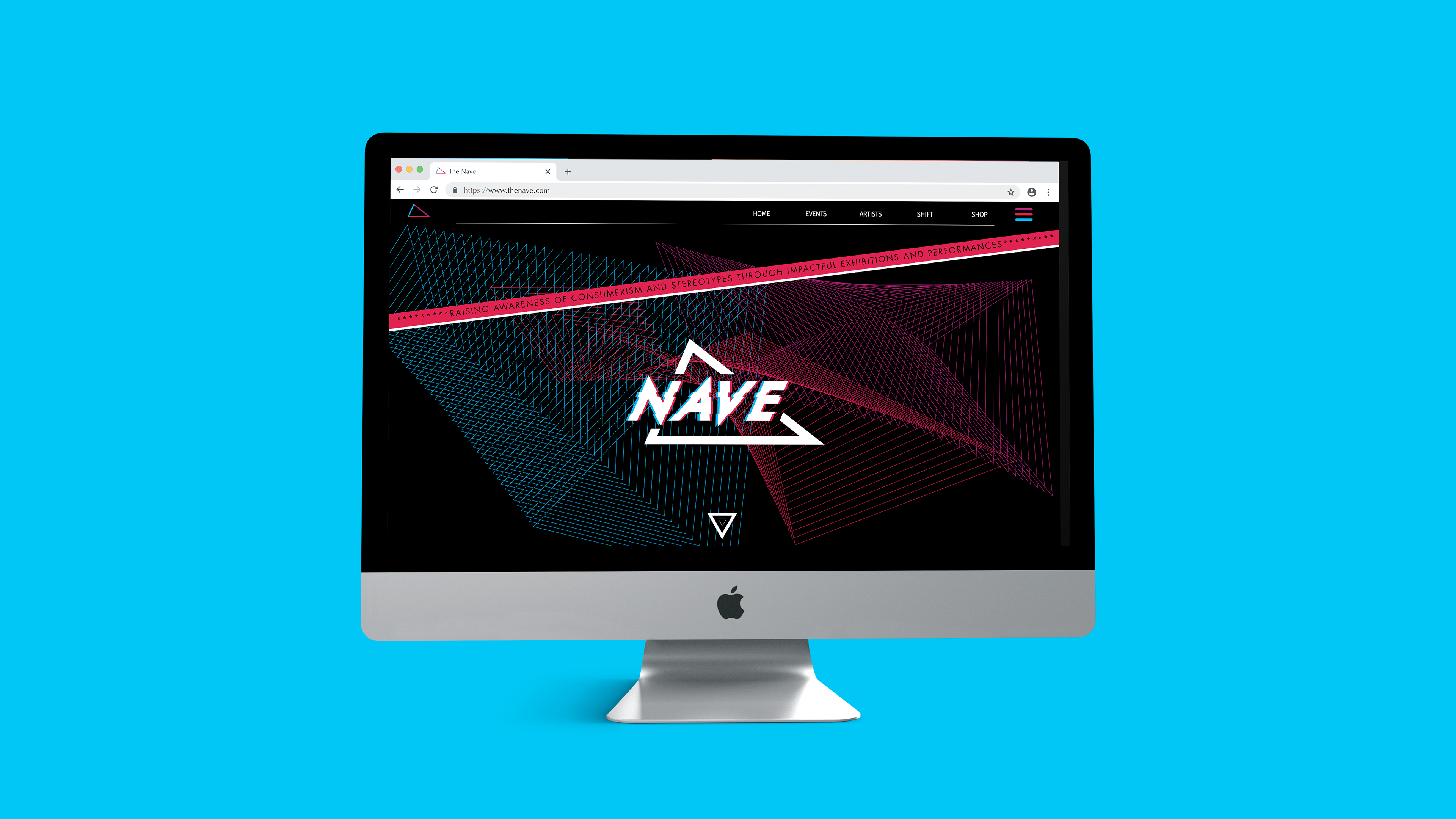
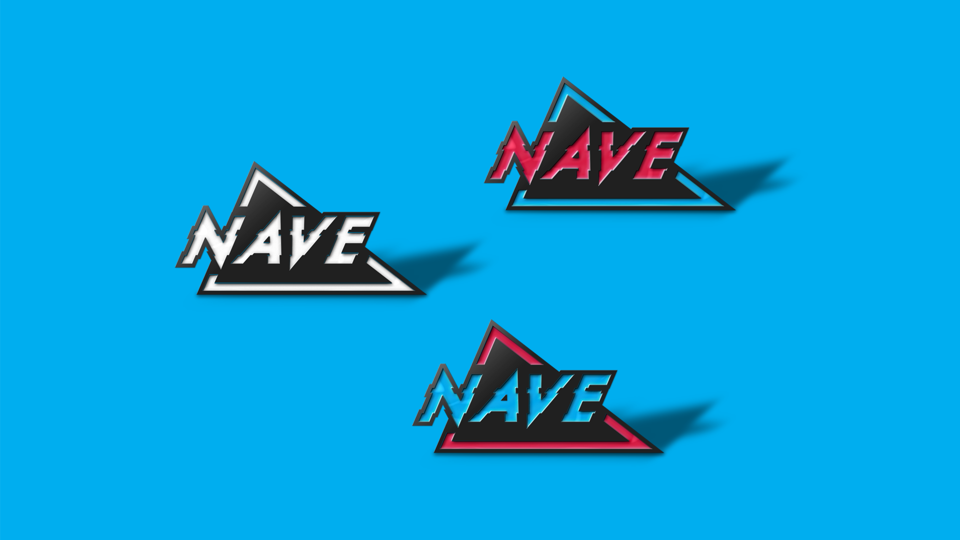
By running discovery workshops with the client, I was able to articulate the strategy and message. I then focused on the idea of a ‘nave’, and how it creates the shape of a triangle when it is observed from any perspective. This triangle changes visually according to the angle from where it is observed - a visual metaphor of how every person sees a different version of the same thing according to their point of view.
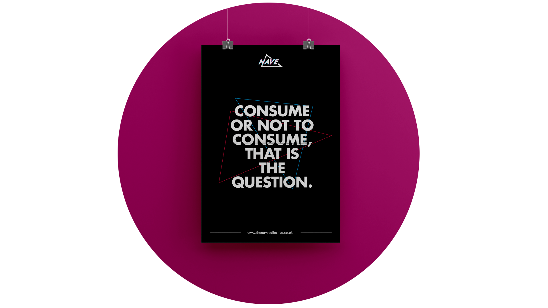
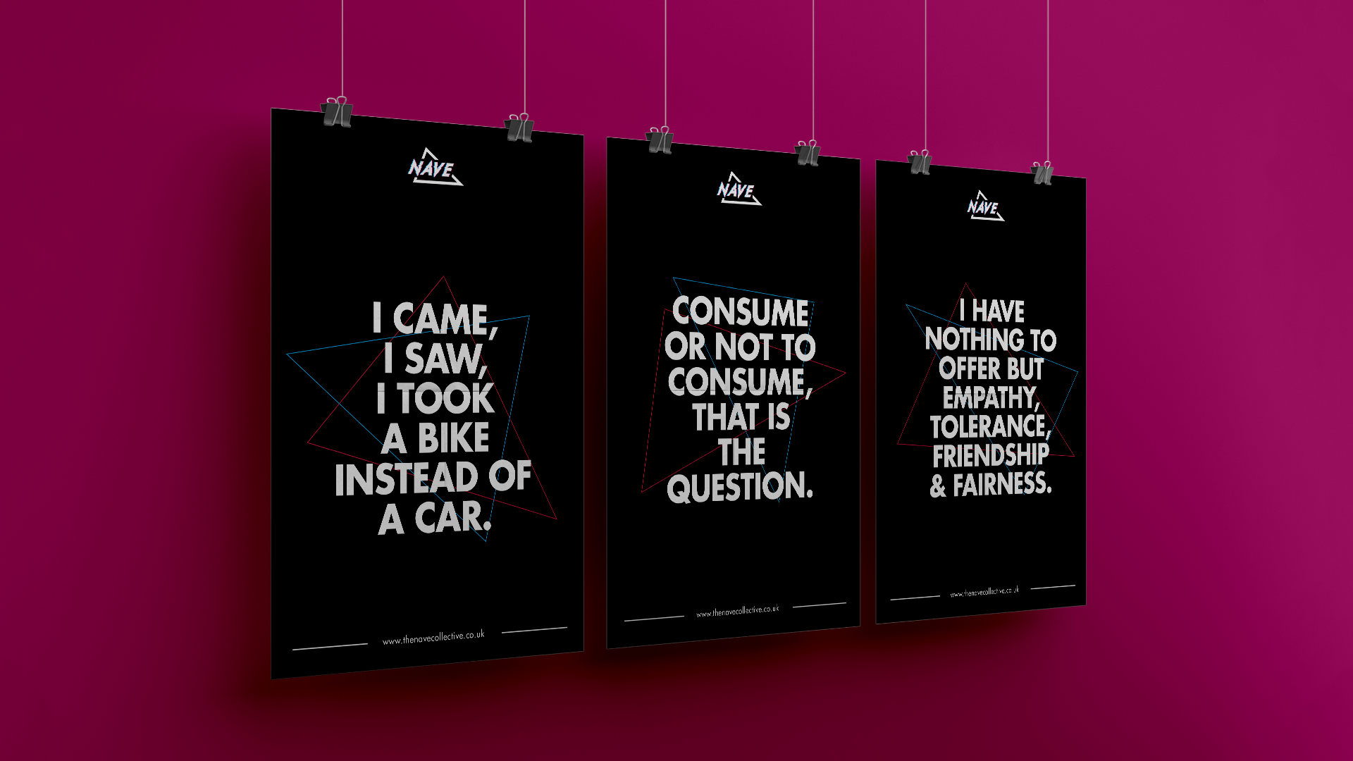
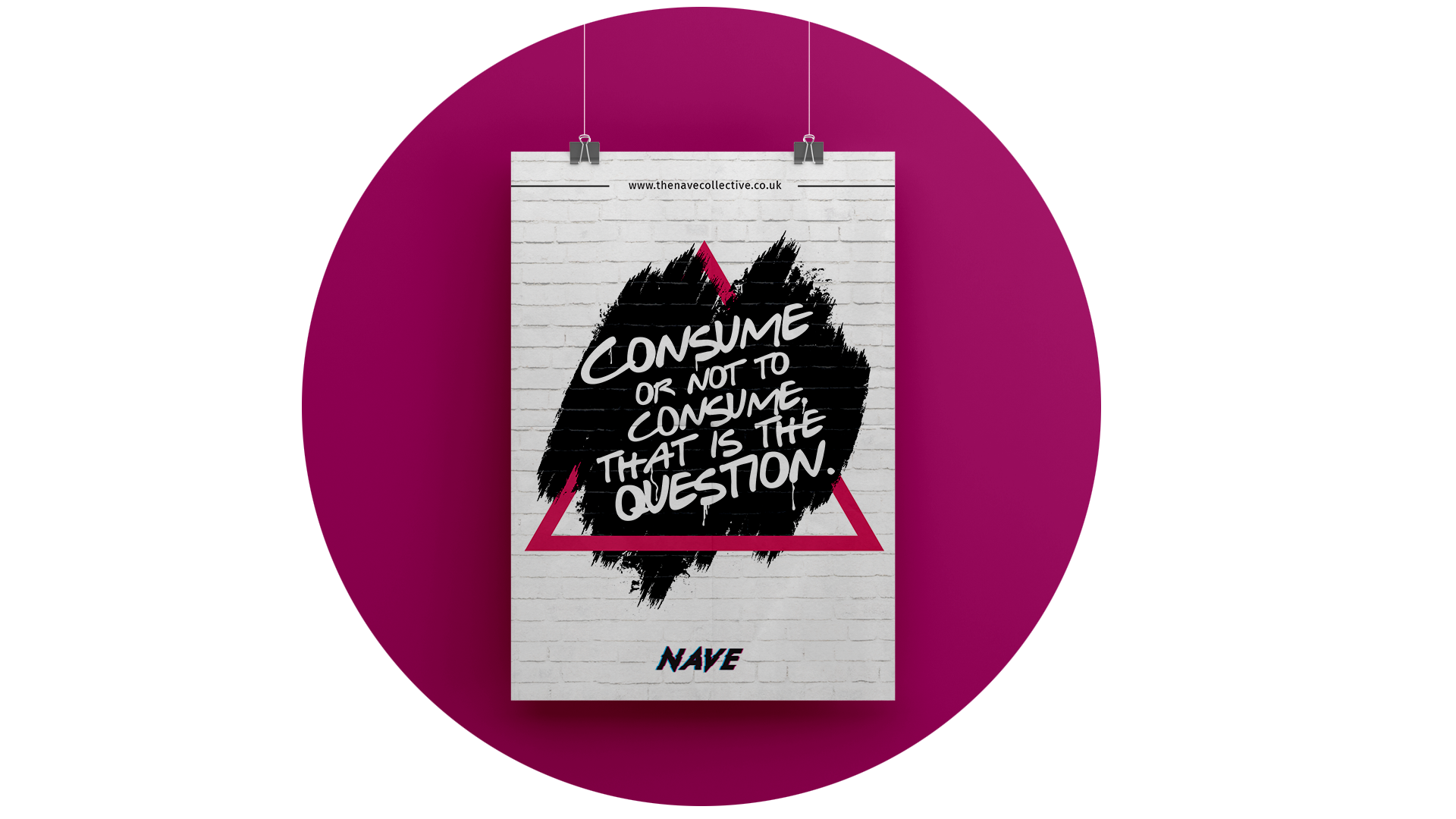
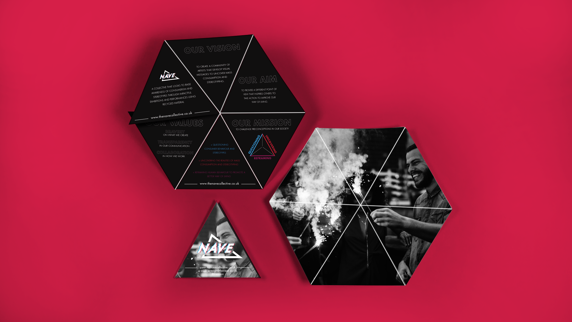
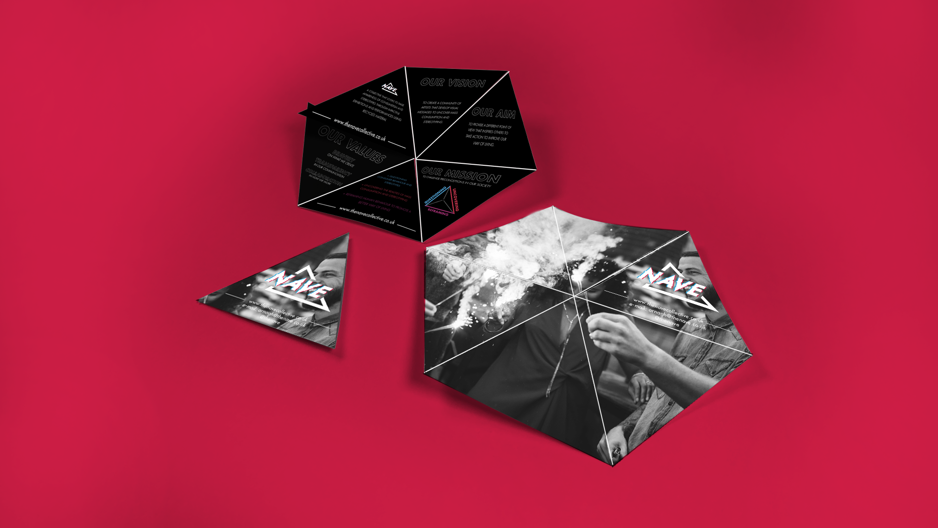
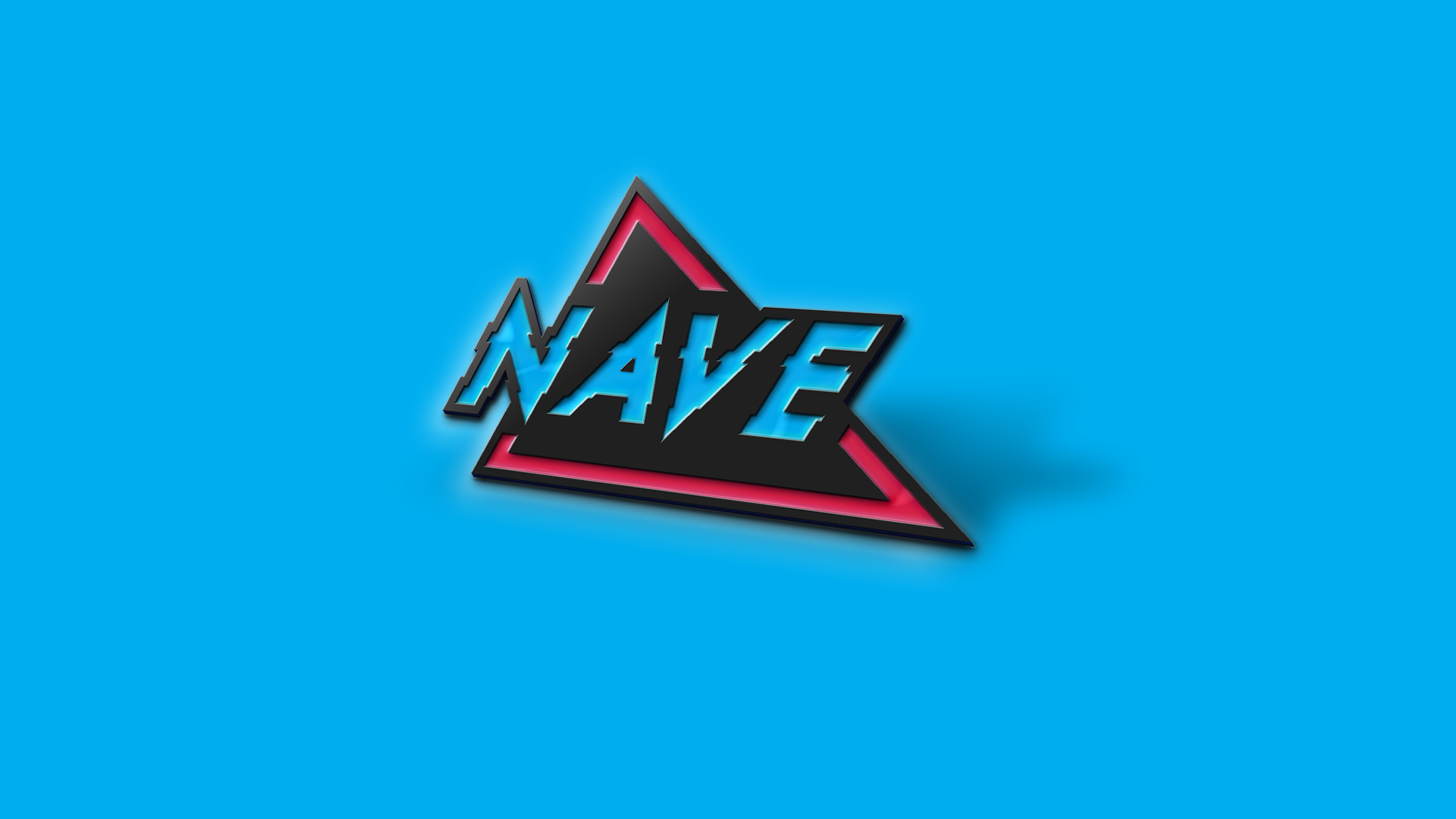
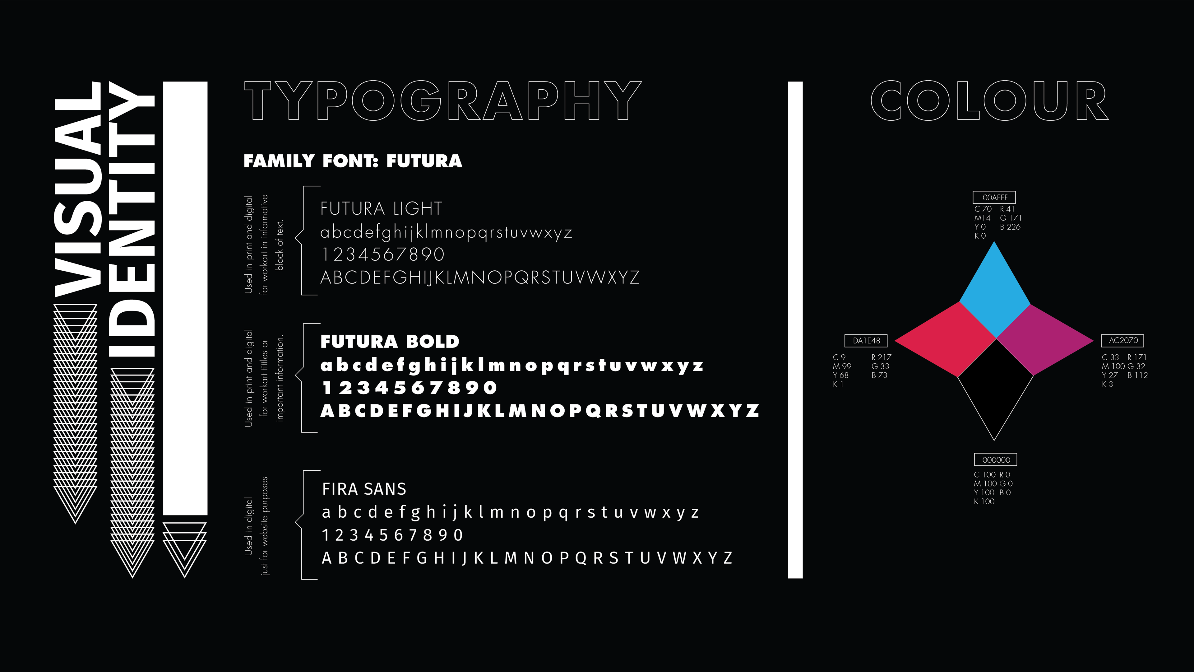
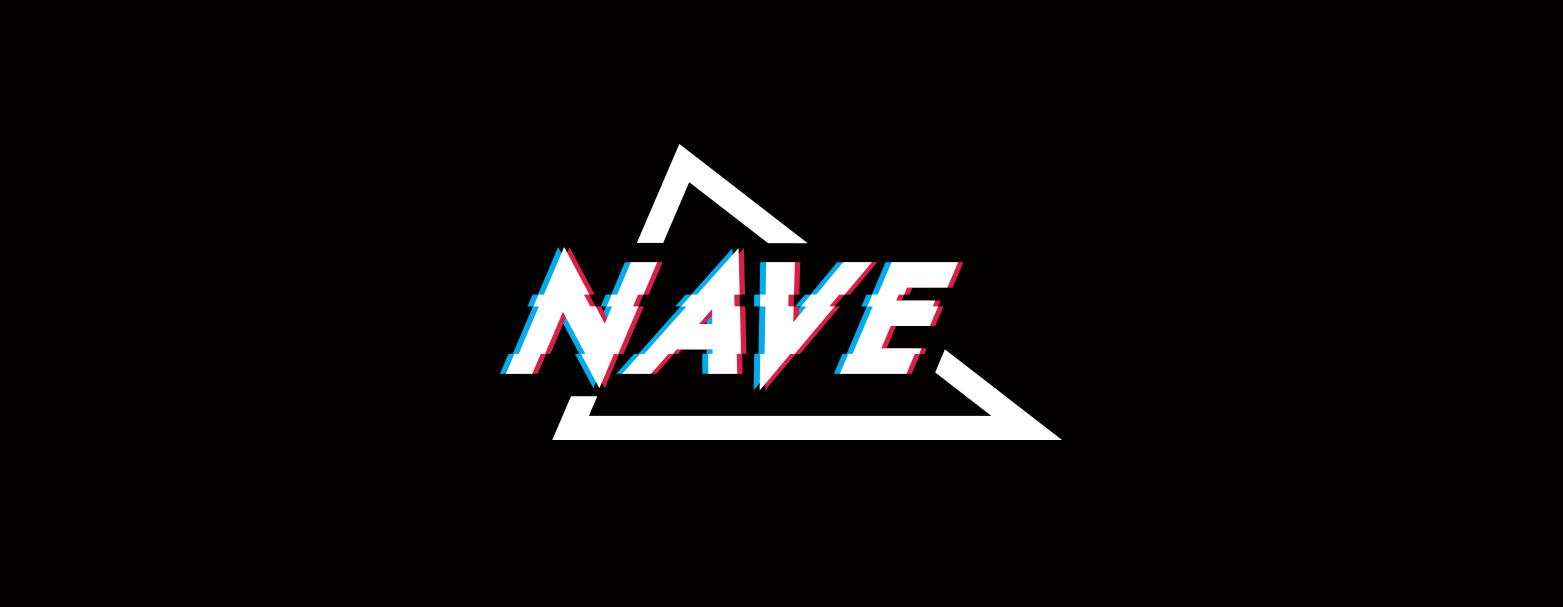
The visual identity uses a red magenta and a blue cyan with a glitch effect, inspired by 80’s 3D glasses aesthetics, which together supports the idea of changing how we observe something. The brand has a strong tone of voice that shows confidence and bravery with a touch of rebelliousness.